
Complete Website Solutions
Your business is great. Your website should make that obvious.
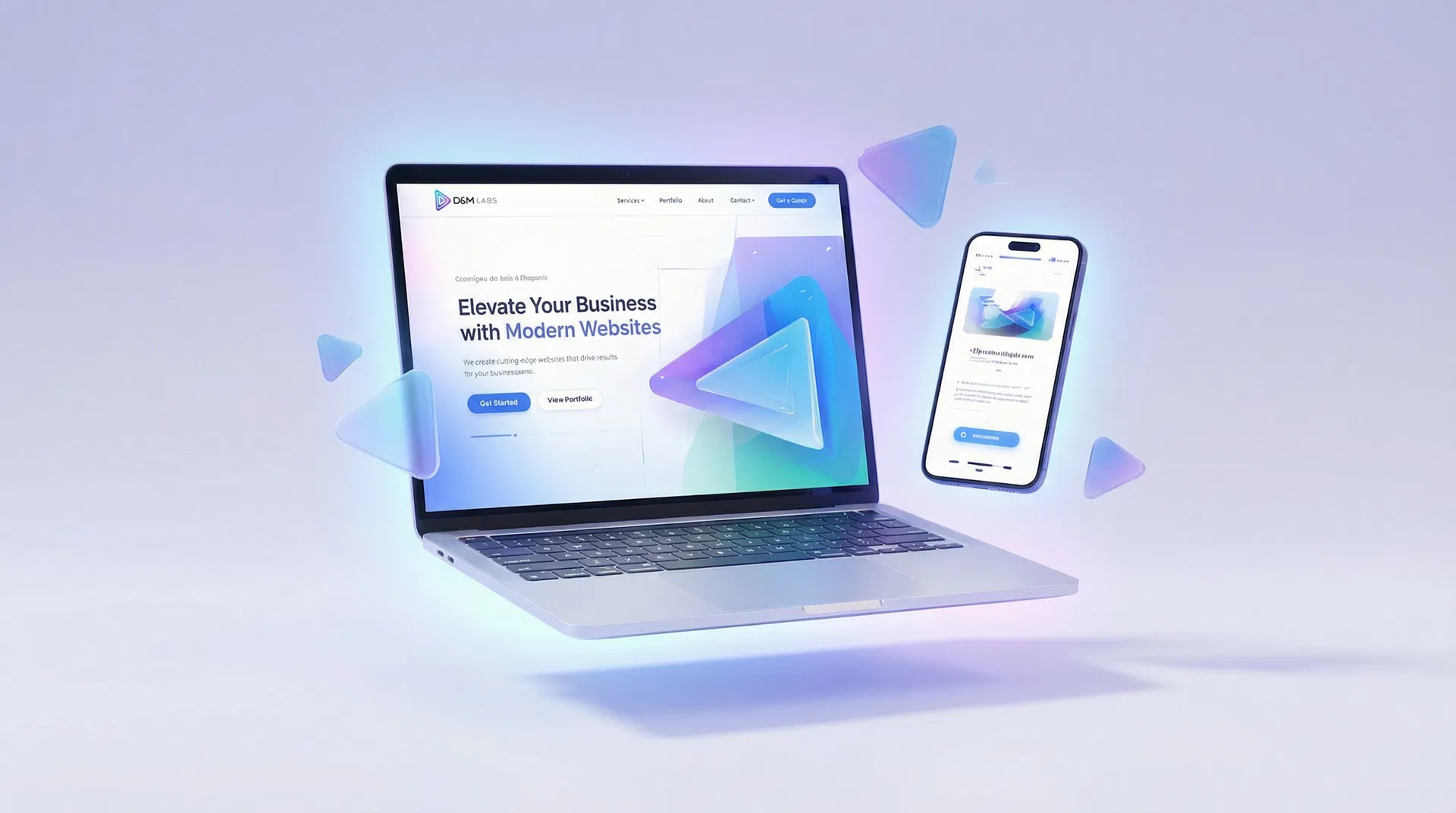
We are a dedicated web design agency. We build professional, fast, and conversion-focused websites for businesses like yours - from €299.
Design Inspiration
See What We Can Create for You
Every website we build is fully custom - designed from scratch around your brand, your content, and your customers. These examples show the range of styles and industries we work with. Think of them as inspiration, not off-the-shelf packages.


Our Services
Expert Solutions for Your Online Presence
Everything you need to establish a professional web presence, from design to launch and beyond.
How It Works
From Idea to Launch in 5 Simple Steps
We've streamlined the process so you can focus on running your business.
Discovery Call
~1 day
Quick WhatsApp chat to understand your business and goals.
Design
2-3 days
We create a custom design based on your brand and preferences.
Build
3-5 days
Your website is developed with clean code, optimised for speed and SEO.
Revisions
1-2 days
We refine the design based on your feedback until you're happy.
Launch
~1 day
We deploy your site, connect your domain, and make sure everything works.
Client Stories
What Our Clients Say
Early feedback from the businesses we've worked with.
"Our new website brought in three new bookings within the first week. The team understood exactly what we needed and delivered faster than I expected. Highly recommend."
Maria K.
Restaurant Owner
"Professional, responsive, and genuinely invested in making our clinic look its best online. The mobile version is perfect - most of our patients book from their phones."
Andreas P.
Physiotherapy Clinic
"I was nervous about getting a website built but DM-Labs.io made it completely stress-free. They handled everything and the result looks incredible. Worth every cent."
Sophia L.
Beauty Salon Owner
Transparent Pricing
Simple, Honest Pricing
No hidden fees. No surprises. Transparent pricing for every project.
Launch Website
A lean online presence for a new business that needs to launch clearly and professionally.
- Small one-page or light two-page site
- Responsive build
- Basic SEO foundations
- WhatsApp and social links
- 2 revision rounds
Growth Website
A conversion-focused site for a business ready to be found, trusted, and contacted online.
- Up to 4 pages
- Contact form
- Google Maps and reviews/testimonials
- Basic SEO
- Search Console and Analytics setup
- 3 revision rounds
Pro Website
For a more complete digital presence with richer content, motion, and stronger search foundations.
- Up to 7 pages
- Gallery or portfolio
- Pop-up and scroll-driven animations
- Full SEO structure
- Blog setup or website visual pack
- 4 revision rounds
Enterprise / Custom
From €1,499
Quote based on scope
For integrations, multilingual builds, CMS self-editing, AI or chatbot features, complex motion, CRM or booking, or unusual content volume.
Contact UsAll plans include a free consultation - no commitment, no pressure.
See full pricing & add-onsIndustries we work with:
Don't see your industry? We work with all types of businesses. Get in touch →
5-14
Days to Launch
from first call
5★
Client Satisfaction
our standard
100%
Mobile Optimised
every project
∞
Ongoing Support
we’re always here
The people behind the work
Who We Are
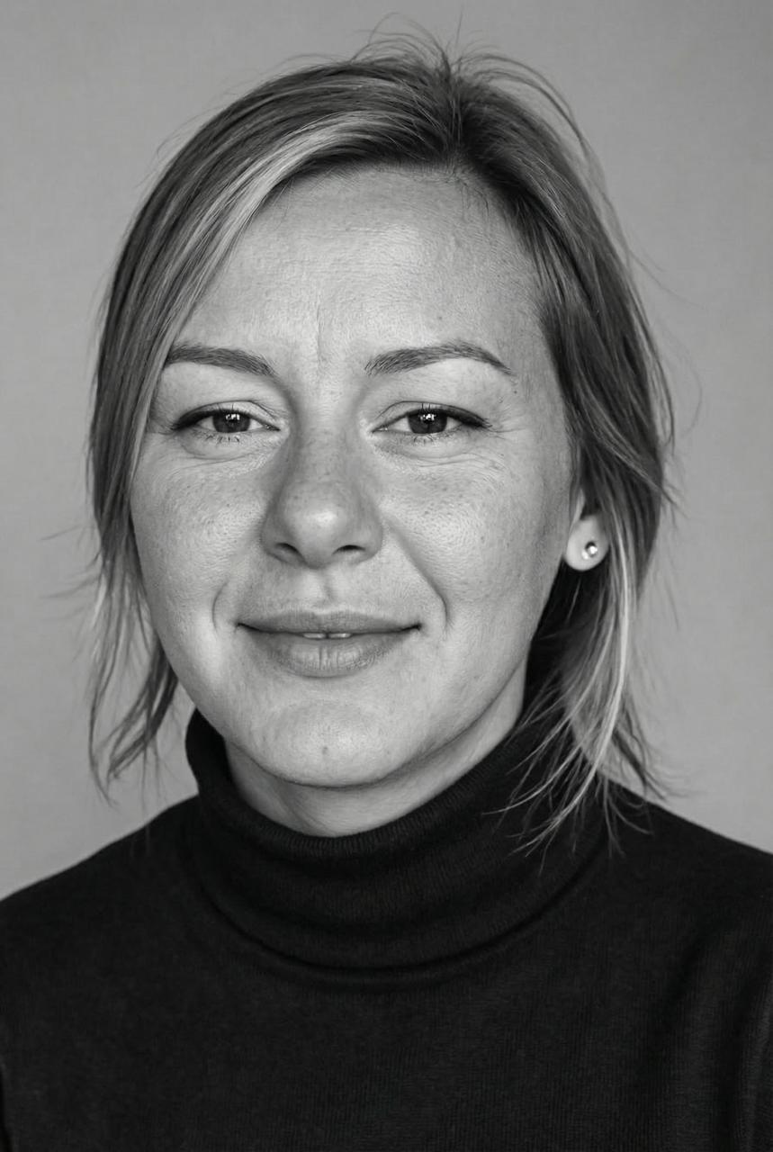
Anastacia B.
Creative Director & AI Specialist
I worked with global tech companies on digital products and AI implementation. I know how to use the best AI tools available today - not to replace craft, but to deliver sharper results, faster, for every client.
“Your website should work as hard as you do.”
Anastacia B.
Creative Director & AI Specialist
I worked with global tech companies on digital products and AI implementation. I understand how to use the best AI tools available today - not to replace craft or human judgment, but to deliver sharper, more effective results for every client we work with.
“Your website should work as hard as you do.”
Tom B.
Technical Director & SEO Expert
My background is in automation, development, and integrating complex systems for global organisations. I love solving the technical side so you never have to think about it.
“First, solve the problem. Then, write the code.”
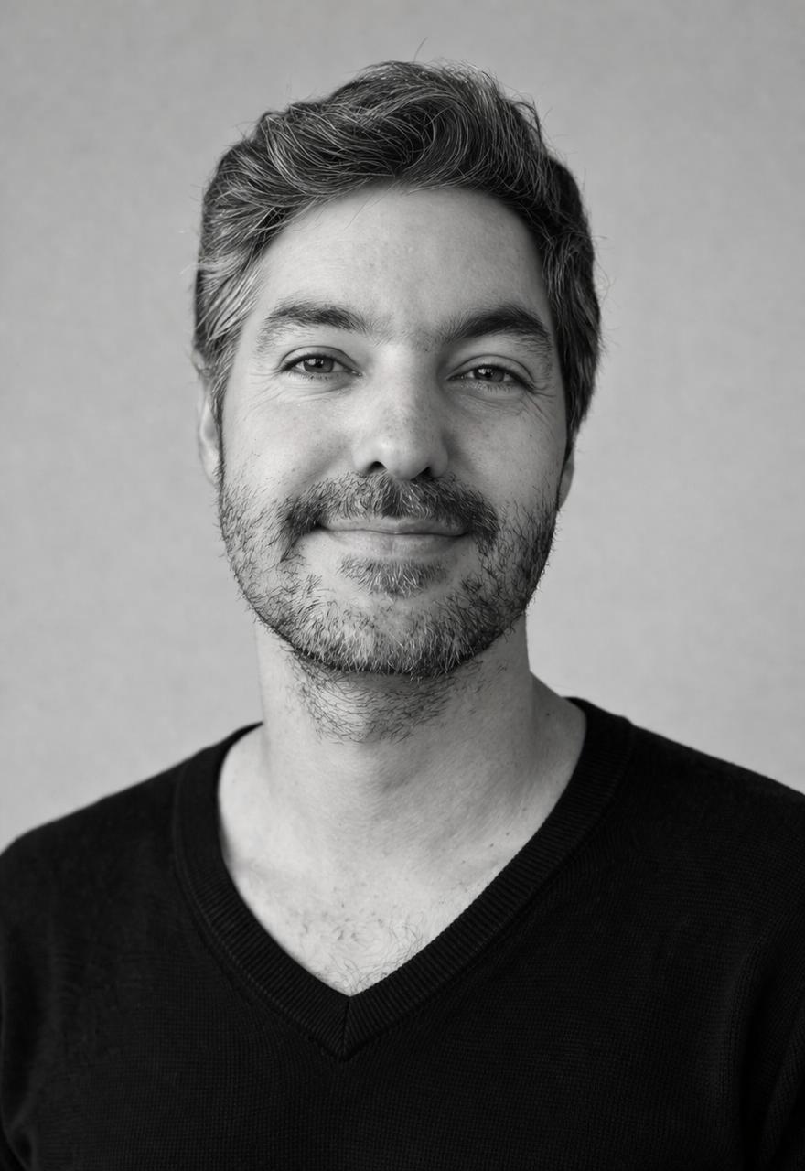
Tom B.
Technical Director & SEO Expert
My background is in automation, development, and integrating complex systems for global organisations. I love solving the technical side of things so you never have to think about it - what you get is a site that is solid, fast, and built to last.
“First, solve the problem. Then, write the code.”

Ready to Start?
Let's Build Your Website Together
Get in touch and we'll get back to you within hours. No commitment, no pressure - just a friendly conversation about your business.